
In this section, we will explain how to select and style text for your web pages. This is going to be a difficult subject since most web design instructors specifically recommend that you not style your text. Their reasoning is that viewers know what family of text they prefer and can set their own preferred font family and font size in their browser. If you call out a font family and size in your CSS file, your settings might over ride the settings of your web viewers.
There are three problems with this line of reasoning. First most people are not aware of how they can set their own font family and font size in their browser.
Second, there is the problem of screen size and resolution. What may appear to be readable on one screen size and resolution may not be readable on a lower resolution or a smaller screen size.
Third and most important, your viewers are not likely to be experts in readability. But if your web page have text that is hard to read, the viewer is less likely to keep reading what you want to tell them – even if they are not aware that their reading problems may be due in part to how the font family used by their browser combined with a possibly low screen resolution is making it hard for them to read your text. .
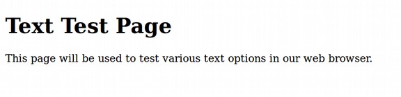
Four all three of these reasons, I specifically recommend that you do select your font family and font sizes. Studies have shown that the San Serif family is more readable on most computer screens than the Serif family. Let’s use Bluefish to start a new html page. Call it myfirsttexttest.html. Here is what the Text Test page looks like initially in the Firefox browser:
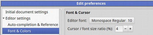
This is different from the default text in the Bluefish Editor. Click on Edit Preferences and you will see that the default font is a sans serif font called Monospace Regular size 10:
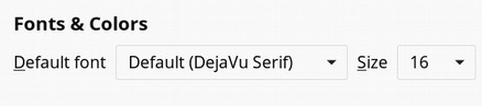
Raise the size to size 12. Then click OK. To see the font settings in Firefox, click on Preferences and scroll down the Settings page to Fonts and Colors. The default is DejaVu Serif set for 16 pixels which is 12 points.
For practice, let’s create a new stylesheet with the Bluefish Style Sheet Builder. Begin with File, New and save the file to your CSS folder as mytexttest.css. Then click on the CSS tab. Then the Style Sheet Builder icon. For the h1 selector, Property select font-family. Then for value, click arial, sans-serif. Then click Add. Repeat for the P selector. Then click File Save. Then in the head of our Text Test HTML file, copy and paste the full URL to your new css sheet. Here is the path to my css sheet (your path may be slightly different):
<link href="file:///home/david/My First Website/css/mytexttest.css" rel="stylesheet" type="text/css" />
Save the HTML file. Then open it in the browser
Our defined font family has overridden the Firefox default font family setting. But it is not yet apparent that the new Sans font family is more readable than the Sans Serif font family.
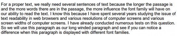
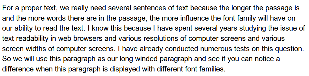
For a proper text, we really need several sentences of text because the longer the passage is and the more words there are in the passage, the more influence the font family will have on our ability to read the text. I know this because I have spent several years studying the issue of text readability in web browsers and various resolutions of computer screens and various screen widths of computer screens. I have already conducted numerous tests on this question. So we will use this paragraph as our long winded paragraph and see if you can notice a difference when this paragraph is displayed with different font families.
Copy and paste the above paragraph into your HTML file. Then put paragraph tags around it. Then save and open it in your browser.
Now delete the link to the CSS file from the head of the HTML document. Then save and view the document again in the browser.
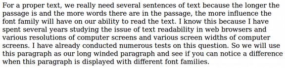
The above test is not really fair because Arial is a much small font set than Deja Vu. You can see that Arial took 7 lines while Deja Vu took 8 lines for the same text. To see if we can create an apples to apples test, let’s create a second CSS sheet with File New and save it as mytexttest2.css. Set h1 for the Times Serift font in size 20px and the P element for Times Serif 12px. Then add to the first style sheet h1 for 20px and the P element for 12px. Save both. Add the Serif style sheet first. Here is the link:
<link href="file:///home/david/My First Website/css/mytexttest2.css" rel="stylesheet" type="text/css" />
Here is the result in the browser.
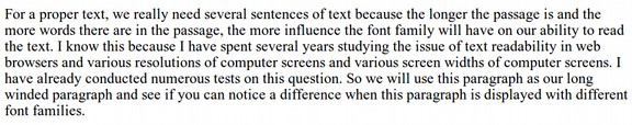
Now delete the number 2 from the CSS link, save the HTML file and view the result in the browser.

Both take up 7 lines, but the San Serif font is slightly smaller. Try font size 13 for the Serif style sheet. Then try again.
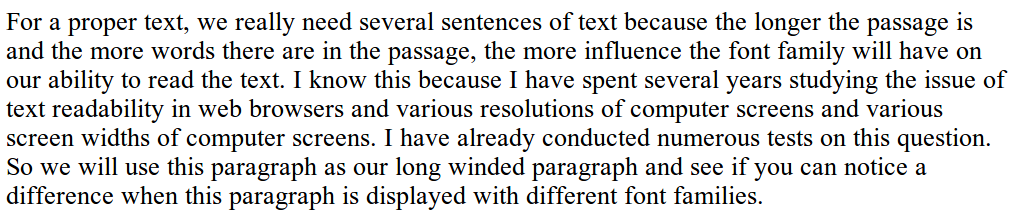
Click back and forth between the two browser windows and read the entire paragraph. Now the only difference is the Serif versus San Serif. Getting rid of the Serif cosmetic styling helps viewers who have lower screen resolutions and smaller screens. Note that I am not compressing either of these images because I want to make the reading as close as possible to a real browser. The file size for the San Serif image is 625KB and the file size for the Serif image is 648KB. The Serif image is .05 inches taller and the Dots Per Inch for both images is identical at 169 DPI.
Increase the Line Spacing on the P element.
Line spacing is a second important factor that affects readability. Actually, it is called Line Spacing in Libre Writer Paragraph Styles. In CSS, it is called Line Height. By default, line height is 120% of the font height. We want to increase it by 10 to 15 percent. We will therefore enter a value of 140%. . Then click Add. Then click OK. Then save the CSS and HTML files and view in the browser.
Compare this to the default line height that is 120% of font height.
Read each paragraph all the way through to see if you notice the difference. Analysis of the image sizes comfirms that the height of the entire paragraph has increased from 1.57 inches to 1.87 inches.
What is the best font size?
There are four common units to measure font size. First is the traditional print standard of points. This is an absolute unit with 72 points equalling one inch. Second is pixels. This is also an absolute unit with 96 pixels equalling one inch. For comparison, the standard 12 pt font equals 16 px. Third and most popular for websites these days is em. This is a relative measure that can change with the base font size which in turn can change with screen widths and several other factors. Last is percent which is also relative to the base font and can change. In general 1 em = 100% = 12pt = 16px.
The current mantra is that all web pages should use em (with an occasional vote for percents) because relative units are more responsive. In particular, both em and percent can grow in size as the reader increases their browser magnification. But the truth is that pixel units and point units will also increase in size as a person increases their browser magnification. Just open our HTML document in the Firefox browser and see for yourself.
While I use em and percent for some styling properties, I prefer fixed units for font size so that I can have a predictable result. We have been using 12pt for the P element. But on the Home page, I often set the font size for 14pt. This is because the Home page should have more images and limited text. On the rest of my instructional websites, I use Sans Serif 12pt because my instructional sites have a lot of text and I want to minimize viewer scrolling. Those who have trouble seeing can always increase the magnification of their browser window.
There is a second and perhaps more important reason I think that points are the best unit of measure. In addition to a more predictable and consistent result, I want to be able to use a universal source document to create a print book, ebook and website. Using points for font sizes allows me to use the same units of measure on all of these devices. Using em or percent for font size means completely redoing my book source document when I create an Ebook or website page. This is terribly inefficient.

Finally, there are some serious problems with EM. Any EM measured under 1 em starts to shrink rapidly. Many authors are starting to recognize this problem. They address it by setting the base em for 1.1. But most still use 1.0 and then run into problems when their font size is suddenly so small that it is unreadable. You can certainly use whatever you want. But in my view, points is the correct unit of measure for font sizes and pixels is the correct unit of measure for predictably defining line hieghts and block heights.
Increase Paragraph Spacing to Increase Readabiliouty
Historically, writers used a tab indent to let the reader know that they were starting a new paragraph. While this was fine for a normal printed page, it is not enough of a clue for reading on a web page. Therefore, nearly all web authors now use block text paragraphs and then add spacing between paragraphs.
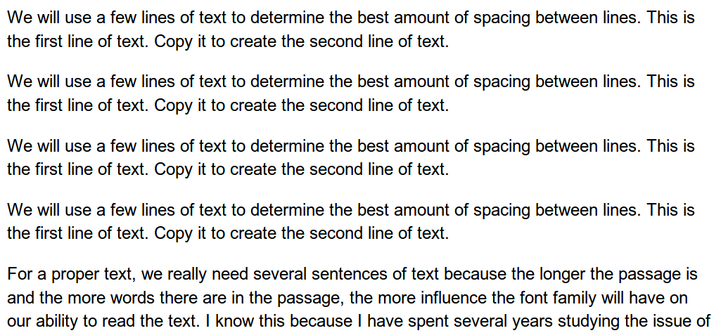
We will use a few lines of text to determine the best amount of spacing between lines. This is the first line of text. Copy it to create the second line of text.
We will use a few lines of text to determine the best amount of spacing between lines. This is the first line of text. Copy it to create the second line of text.
We will use a few lines of text to determine the best amount of spacing between lines. This is the first line of text. Copy it to create the second line of text.
We will use a few lines of text to determine the best amount of spacing between lines. This is the first line of text. Copy it to create the second line of text.
Now copy and paste the above four paragraphs into your HTML file and put paragraph tags around each paragraph. Then click Save and open in a browser.
By default, Firefox puts a significant amount of space between paragraphs. But if you put the same HTML file on an Ereader, you could get a different result. I therefore recommend setting the paragraph spacing with CSS. There are two ways to increase the paragraph spacing with CSS. The first is to increase the padding above and below the paragraph. The second is to increase the margins above and below the paragraph.
Margins generally are more reliable. But either will do. As before, I prefer to specify the value in pixels in order to keep the same result regardless of screen size or font size. Because I like to have margins all of the way around the text (top, bottom and both sides), I recommend this simple shorthand code:
p {margin; 10 px;}. This will put 10px above and 10px below each paragraph for a total of 20px between paragraphs. You can either type this into to your CSS file or use the CSS File Builder. Then save the CSS and HTML files and view the result in the browser. The result is about the same as the default setting. But now I can be certain that all Ereaders will also have this spacing between paragraphs.
What is not a good practice is to put empty paragraph tags or empty line break tags between paragraphs. This messes up the code and may create problems for web pages and E readers.
Why We Should Create Less Line Hieght Below Heading Tags
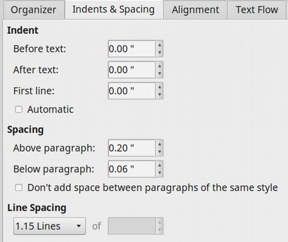
Heading tags are always supposed to be connected to the paragraph below them and represent a change from any paragraph above them. In Libre Writer Paragraph Styles, this issue is generally addressed by clicking on the heading paragraph style. Then click Modify. Then click on the Indents and Spacing tab. Then set the spacing below the heading paragraph to be much less than the spacing below the paragraph. Below, a heading has been set for 0.20 inches above but only 0.06 inches below.
We can provide something similar with CSS by using the margin property. For example:
h1 {margin-top: 20px; margin-bottom: 6px;}
Italic and Bold
I generally do not recommend italic because it is difficult to read. You can set elements you want bold such as your heading tags with the font-weight property. We generally set the font weight for the heading elements to be bold like this: h1 {font-weight: bold;}
How to Center Text
We generally want our initial heading to be centered and sub headings to be aligned left. Here is how to center align the h1 text.
h1 {text-align: center; }
You can do the same for a paragraph tag. But to center align the entire box for a divide, you also should add margin: 0 auto.
p {text-align: center; }
div {text-align: center; margin: 0 auto;}
How to Eliminate Link Underlines
By default, most web browsers will display links with underlines – which can make it difficult to read the link. You can fix this problem by placing the following in your CSS sheet:
a {text-decoration: none; }
How to Create Text Hover Effects
It is common to have a link or menu item change color when a mouse is hovered over the link. To change the colour of your text you simply use the property, color, like so:
a {color: 0000ff; }
a:active {color: #000099; }
What’s Next?
This completes our discussion on selecting and using text for web pages. In the next section, we will take a closer look at how to specify and use colors on web pages.