
In the last section, we used tables and data cells to layout the different areas of our web page. In this section, we will create a more responsive layout by replacing the table and data cell tags with divide tags. The <div> tag is used as a box for other elements including headings and paragraphs. Because divides can float on a page, they are more responsive for various screen widths than tables. There are two different methods for creating layouts with divides. The old way is to use the float property. The newer better way is to use inline blocks.
The Good, the Bad and the Ugly about Floating Elements
The simple truth is that the float property was never really designed for page layout. It was originally designed to allow text to flow around images by floating images to the left or right of the text. So we should really think of the float property to be like the Wrap Left and Wrap Right Image properties in Libre Writer. Wrap the text left and align the image right is the same as Float the image right.
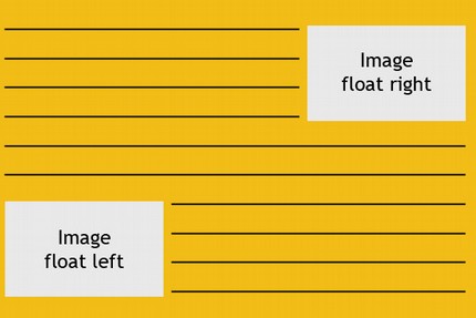
rom the very beginning, the float property had problems. For example, if you want space around a floated image, you had to add the margins to the floated image element – not to the text next to the image! Why was this? Well, the float property takes the image out of the document flow. So the image ignores text formatting as if it did not even exist.
Then Steve Jobs came up with the idea of putting a computer inside of a phone… or was it a phone inside of a computer? Either way, folks wanted to start looking at web sites on phones with tiny screens. This of course was a terrible idea and one which I firmly opposed and said would never fly because it is extremely difficult to read text on very narrow screens. Don’t do it!
Despite me spending years telling people not to waste their hard earned money on computers with tiny screens, eventually everyone was using mobile phones (I refuse to call them smart because there is nothing smart about them). Anyway, this crazy phone revolution led to the need for responsive layouts. For a couple of years, we struggled on with using tables to layout web pages with the trick of using a normal table for our real page layout and then switching to a single column table for smaller screen sizes.
But this meant not only two CSS sheets, but two whole websites. Eventually, web designers stopped using tables for page layout. Then some bright mind came up with the idea of using the float property, not merely to move images around on the page, but to also move boxes of content around on the page. This insanity went on for about 10 years and was only recently replaced by inline blocks, Flex boxes and a series of other developments we will cover at the end of this section. But first, we will learn how to do some simple layouts with floats – not just to take a trip down memory lane - but to help you see why you do not want to use floats for page layouts.
Two Column Layout Using Divide Blocks and Floats
Here is what the divide structure for our floating layout will look like:
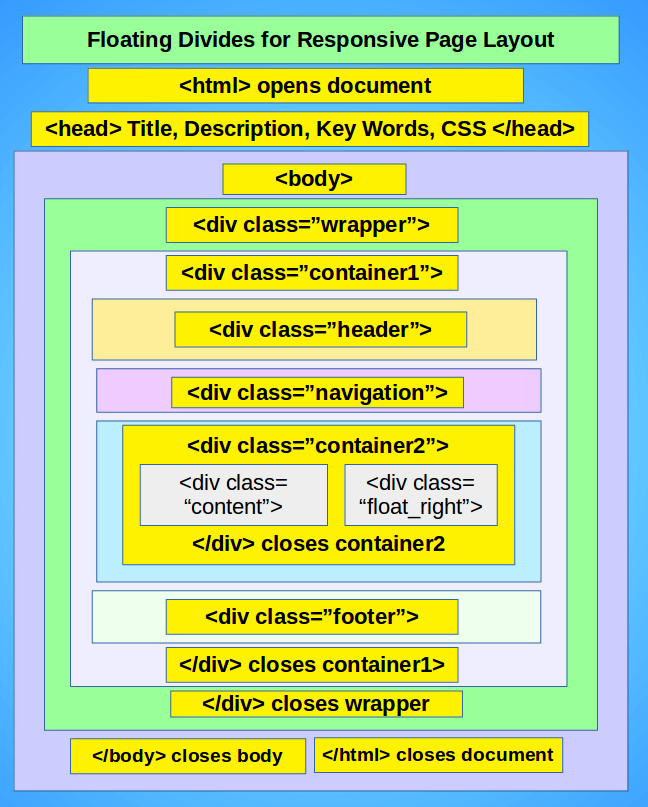
Recall from the end of the last section, that when we changed from a one column table to a two column table, we added another table inside of a data cell in order to reset the number of columns. We will do something similar with our divides. When we reach the main content area where we will be adding a second column, instead of adding a new table, we will add a new wrapper to go around our divides in this row of elements.
To distingush this interior wrapper from the main wrapper which goes around all of the elements, we will call this interior wrapper a container. Any time you want to change the number of columns in a row, simply add a container around the new row.
Example of a Two Column Layout Based on Divide Blocks
Create a new website root folder called My Div Page Layouts. Then inside of this folder put a css folder. Now start Bluefish and save a copy of our previous index.html file into the new root folder. Then delete the table from this new index.html file and insert a heading and paragraph inside of the wrapper. Then below the wrapper, insert five pairs of div tags. Use Tags, MISC, Div to insert the five tag pairs. Inside the opening div tags just before the ending bracket, type a space and insert a class. Then in the paratheses, type the following five classes: container1, header, navigation, container, footer.
Then inside the last four divide tag pairs, type what each divide stands for and put the sentences in paragraph tags. Then move the container1 closing divide tag below the footer closing divide tag. Here is our html so far:
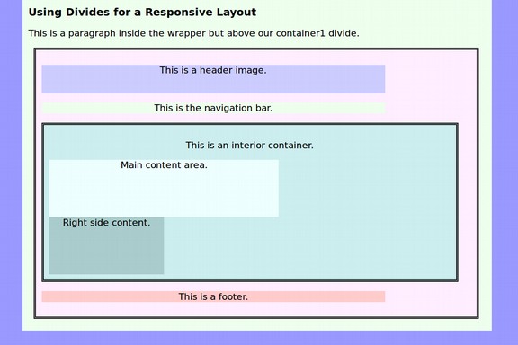
<body><div class="wrapper">
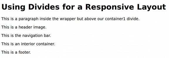
<h1>Using Divides for a Responsive Layout</h1>
<p>This is a paragraph inside the wrapper but above our heading divide. </p>
<div class="container1">
<div class="header"><p>This is a header image.</p></div>
<div class="navigation"><p>This is the navigation bar.</p> </div>
<div class="container"><p>This is a container.</p> </div>
<div class="footer"><p>This is a footer.</p> </div></div></div></body>
Save the file and view it in a browser:
Now copy our previous CSS file into our new css folder. Then open the new css file and make a few changes:
#1 Replace the selector table with div .container1 and change the width to max-width; 650px.
#2 Replace the selector td with div.container2 and change the width to max-width: 620px. Also add the background-color #cceeee.
#3 Replace the selector td.heading with div.header and change the width to max-width: 600px
#4 Replace the selector td.navigation with div.navigation and change the width to max-width: 600px.
#5 Replace the selector td.content with div.content
#6 Replace the selector td.content2 with div.content2
#7 Replace the selector td.footer with div.footer and change the width to max-width: 600px. Then save the CSS and HTML and view the page in your browser.
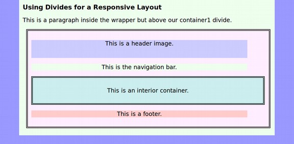
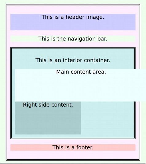
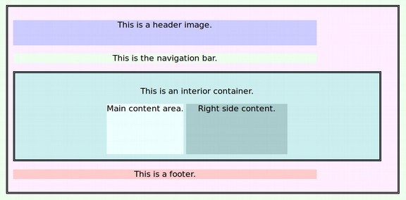
Note that the exterior container has taken the place of our first table and the interior container has taken the place of our third row cell. We can now insert two more divides inside of the interior container. Give the first one the class of content1 and the second one the class of content2. Type in what each divide stands for. Then save the file and view it in your browser.
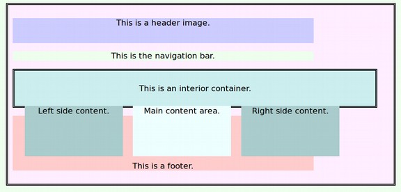
Sadly, the right side content box has been pushed down below the main content box. This illustrates an important point. Whenever there is not enough room in the layout, divides will simply move down the page.
Grab the lower right corner of the browser window with your cursor and move the width out to 9 inches and then in to 5 inches to see how the page looks with various screen widths. Note that even on the maximum screen width, the width of the page does not exceed 700 pixels. Then, when the screen is narrowed to only 4 inches, everything shrinks except the main content area:
Change the content1 selector to max-width: 400px. Now it shrinks with a narrow screen. But the right side content box remains below the main content box.
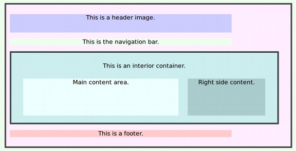
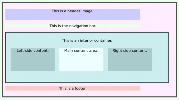
We have two choices. Either we can expand our two containers by 20 pixels each or reduce the size of one of our content boxes. Let’s increase the wrapper to 800px, the first container to 750px and the second container to 700px. Then save the CSS and HTML files and view in the browser.
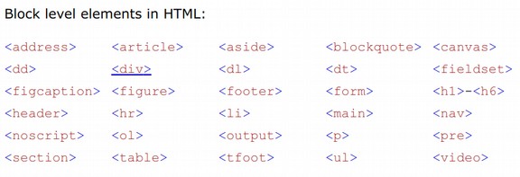
There is clearly enough room for the right side content to move up now. This brings up a second important point about Divides – namely, that by default, they have a property called diplay: block. This means that they do not let anything else on the same row. Here is a table of all of the block level elements.
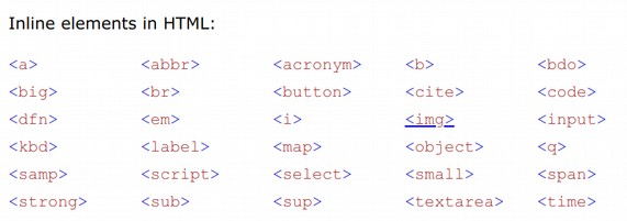
Other elements display as inline meaning that they do not start on a new line and they take up as little room as possible. Images are an example of an element that has the property display: inline-block.
Thankfully, we can change divides from display: block to display: inline block just by adding this to the CSS of content1 and content2: display: inline-block;.
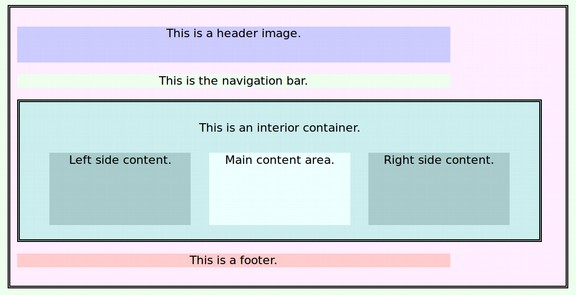
Both boxes are now on the same row. But they have been reduced to the size of the text. Let’s change the width to 60% for content1 and 30% for content2. Also add margin: 10px; to both.
Grab the lower right corner of the browser window and vary the width. As the width gets narrow, the right box will fall below the left box. We can even add a third box (or fourth box) as long as they fit within the outer container and all have the property display: inline block. Add another divide to the HTML with a class of content3. Then make the width for content 1, 2 and 3 to be 28%.
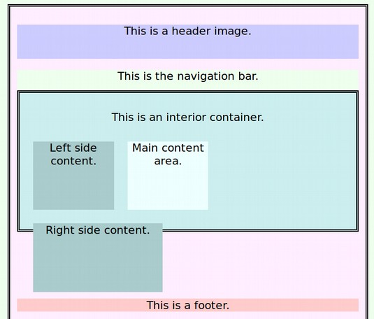
This Divide Block layout looks good on wider screens. But grab the lower right corner of the browser window and make the screen narrower to see how this layout would look on a mobile phone. Suddenly, there is a major problem.
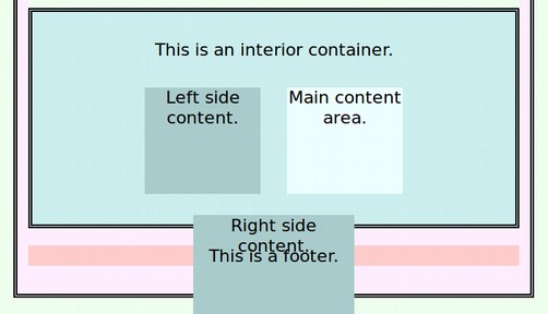
The far right block falls below the other content blocks and appears to be outside of the interior container. We will cover a solution to this problem in a moment. But first, let’s look at using the float property to create page layouts.
Floating Elements
Since divides are block-level (i.e., they default to 100% of the available screen width and add line breaks between each other), they all just stack up underneath one another - unless you position them in some way. One way to overcome the display equals block default property of divides is to use the CSS float property. You can float any element left or right, and it will align itself over to the side of whatever element it is contained within. For example, for content1, 2 and 3, delete, display: inline-block and instead add float: left; to all three elements.
Oh no! All three boxes have left their container! The cause of this problem is that the float property takes an element out of the document flow. This allows elements below them such as the footer to come up and take their space.
The Empty Div Float Fix is, quite literally, to place an empty div. <div
style="clear: both;"></div> after
the final floated element. You could also assign the div with a clearfloat class and then put the property clear both into the CSS sheet. You should clear the float after the floated elements in the container but before the close of the container that the floated divides are in. Another more direct way to solve the problem is to add height: 100px to container2.
Again, the layout looks good in a wide screen. But bring the browser window in and once again, there is a problem on narrow screens:
There is no good way to solve this problem using floats. Floats also have trouble centering the middle block. There is float right and left but no float center. Thankfully, there is a way to solve both of these problems with a simple modification to inline blocks. We will cover this in the next section.