
In the previous section, we ran into problems with page layouts breaking on narrow screens with both the inline block method and the float method. In this section, we will cover two ways of solving this problem – both of which use the Text Align property. First, we will look at Text Align Justify and then Text Align Center.
The Text Align Justify Method
A key to understanding inline-blocks is that they behave as if they are words in a sentence. Each block is one word. Let’s use the word BLOCK to stand for the block element. If we type the word block three times and then align it left or float it left, we get this:
BLOCK BLOCK BLOCK
There is too much space on the right. Take the same three words and align or float them right, we get this:
BLOCK BLOCK BLOCK
Now there is too much space on the left. Take the same three blocks and align them justified:
BLOCK BLOCK BLOCK
They behave as if they are aligned left. This is because the Justify alignment is not triggered until the text flows onto a second line. Let’s add two more blocks and place some space between them to create a second line. Here is how the blocks look with the normal align left.
BLOCK BLOCK BLOCK BLOCK BLOCK
Note that the blocks are not centered. Take this group of five blocks and copy paste it below. Then set the paragraph style for Alignment Justified.
BLOCK BLOCK BLOCK BLOCK BLOCK
The first three blocks now are centered on the row.
Now imagine if we could replace the last two blocks with a very long but hidden word or special hidden block so that there would always be more than one line after the first three blocks. This is the theory behind the Text Align Justify method. What it really does is treat blocks as if they were words and then justify the blocks on the page by adding a hidden element after the blocks to make sure the blocks are in a paragraph that is more than one line long. You can then have one block, two blocks, three blocks, four blocks or more and they will all line up equally across the row in your web page. Let’s look at some examples.
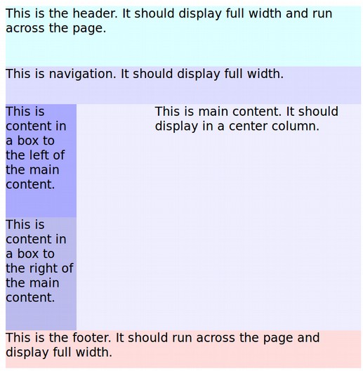
Create a new root folder called My Justify Page Layouts. Then open Bluefish and create an index.html file. Copy and paste this HTML into the body section:
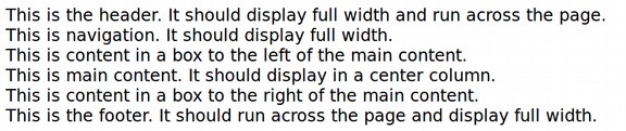
<div class="container"> <div class="header">This is the header. It displays full width. </div> <div class="nav">This is navigation. It should display full width. </div> <div class="left">This is a box to the left of the main content. </div> <div class="main">This is main content in a center column. </div> <div class="right">This is a box to the right of the main content. </div> <div class="footer">This is the footer. It displays full width. </div> </div>
This is just five blocks. Here is what it looks like in a browser:
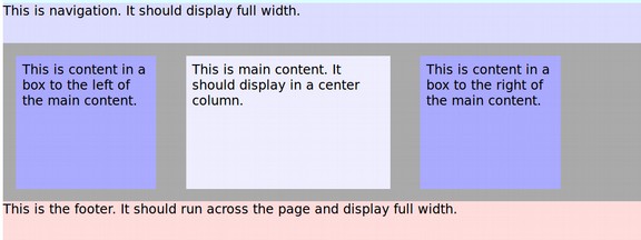
Now put this CSS in a style sheet or into the head of the HTML file with <style>.
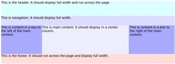
.container { text-align: justify; background-color: #aaaaff; } .header, .nav, .left, .main, footer, .right { vertical-align: top; display: inline-block; width: 100%; } .header { height: 80px; text-align: left; background-color: #ddffff;} .nav {height:50px; text-align:left;background-color: #ddddff; } .left { width: 23%; height:150px; text-align:left; background-color: #aaaaff; } .main { width: 50%; height:150px; text-align:left; background-color: #eeeeff;} .right { width: 23%; height:150px; text-align: left; background-color:#aaaaff; } .footer {height: 50px; text-align: left; background-color: #ffdddd;}
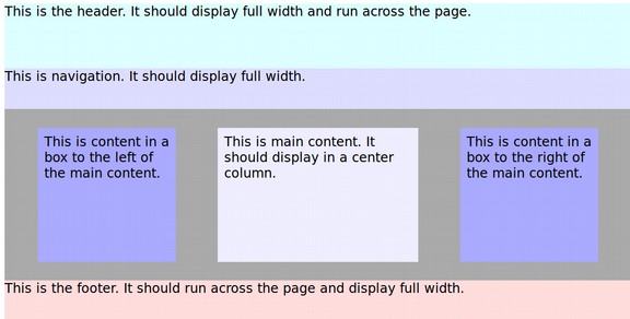
Now save the file and view it in a browser. Here is the wide view:
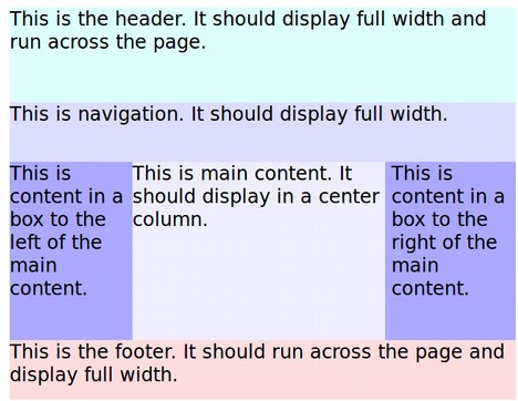
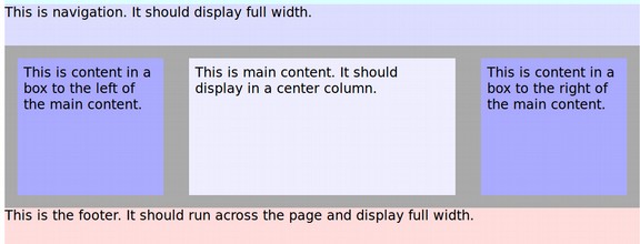
Here is the narrow view.
Three Problems with the Text Align Justify Method
There are at least three minor problems with the Text Align Justify method. These are white spacing between the blocks, ghost spacing on narrow screens and X. There are several ways to solve each of these problems.
White Spacing Between Blocks
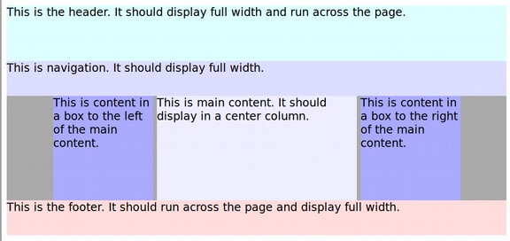
As we noted above, inline blocks act like words. Just as there are white spaces between each block. Here is an image of these white spaces.
We have hidden this problem by making the container background the same color as the two side blocks. You could also hide white spaces by going to your index.html file and eliminating the paragraph breaks between closing and opening divides. Instead of this:
<div class="left">This is a box to the left of the main content. </div> <div class="main">This is main content a center column. </div> <div class="right">This is a box to the right of the main content. </div>
Do this:
<div class="left">This is a box to the left of the main content. </div><div class="main">This is main content in a center column. </div><div class="right">This is a box to the right of the main content. </div>
You could also set the font size property to 0px in the parent or container element and then add the correct font sizes back in each of the child content elements.
Ghost Spacing on Narrow Screens
Another problem is that the margins and white spacing will take up some of the spacing. If the total of your content boxes equals 100%, the right box will fall below the other boxes on narrow screens.
Here is an example what happens if the total widths of all content boxes equals 100% and the screen size is very narrow.
The solution to this problem is to have the total width of the boxes be less than 100%. Typically, setting the total of all three widths to 96% solves this problem even on the narrowest of screens.
Forcing Inline Block Text Align Justify with a Hidden Second Row
Sometimes Text Align Justify has unpredictable results. This is often due to a blocks winding up on a second row that is not a full row. In such cases, the orphaned block will be left aligned. To make our hidden element, we will use the span tag because it is an inline element as opposed to a block element. Alternately, you can use a divide element as long as you change its display attribute from block to inline block.
Change the container background color to gray so you can see it better. Then add to all three content boxes, margins of 2% and padding of 1%. Also change the width of the three boxes to 20%, 30% and 20%. Then save and view in your browser:
You can see that the boxes are left aligned rather than justified. This is a clue that the second line is not present and therefore align text justified has not been triggered. We need to force the line to extend full width by inserting an element at the end of the line that will occupy more than the left available space and then hiding it. Add this empty span element to the HTML just below the final content box : <span></span>
Then add this selector to the CSS:
span { display: inline-block; position: relative; width: 100%; height: 0px;}
Here is the result displayed in the browser:
The hidden span forces the width of the element to 100%, which causes a line break since it is considered an inline element due to the display:
inline-block rule. Adding in the inline-block
property to the span also makes block-level rules like width possible and this causes the element to extend to the full length of the line. Finally, it allows the height rule which when set for 0px makes the entire span invisible.
The Text Align Center Method
There may be times when you do not want the outer content boxes to run all the way to the right or left edges of the browser window. In this case, inside of using the Text Align Justify property value in the parent container, change it to Text Align Center. Make the backgrounds different colors to better see what is happening and also add margin: auto; to the container CSS and reduce the width of the content boxes from 23% -50%- 23% to 20%-40%-20% .
Here is the result.
The gray color is the color of the container. The layout displays correctly in all screen widths. However, it takes a bit of math to get the boxes to be evenly spaced. We will add margin: 3% to all three content boxes, padding 1% inside of the boxes and reduce the width of the middle box to 30%.
Always test the result not just in a wide screen but by bringing the browser window in to make sure the right box does not drop in a narrow screen.
HTML5 Page Layout
HTML 4 is about 20 years old. Some would like to replace it with HTML 5 which achieved its current form in 2016. We do not have space to cover all of the differences between HTML 4 and HTML 5, but we will cover one key difference which is the naming of tags used for page layout in HTML 5. HTML 5 is backwardly compatible with most of HTML 4 tags. But it also introduces some new more descriptive tags that already work in nearly all modern browsers.
To understand the difference between HTML 4 and HTML 5, we need to consider three rather abstract terms, namely structural markup, presentational markup and semantic markup. This is because one of the main goals of HTML 5 is to gradually but eventually eliminate presentational markup and also add semantic markup as a new type of structural markup.
What is Structural Markup?
The word markup merely refers to the use of HTML tags to tell web browsers what to do with the content that is between the tags. For example, the <h1> tag tells the web browser that the content inside of the tag is a top level heading and thus the browser should apply the h1 CSS to this content. Heading tags are considered to be Structural markup and are not changed by HTML 5. Other structural tags include the <body> tag, the <div> tag which divides or adds a new box to the web page and the <p> tag which adds a new paragraph to a page.
What is Presentational Markup and why is it bad?
Presentational markup is markup or HTML tags that try to tell the browser how the content should look. Consider the following Presentational markup:
<h1><b>This is a Heading</b></h>
The <b> tag tells the browser that the content inside of the <b> tag should be bold. The coding gods do not want us to use HTML tags to describe the appearance of content. They only want HTML to be used to describe the structure of the content. Anything related to the appearance of the content is supposed to go into the CSS. Therefore, with an HTML 5 document, you are no longer allowed to use the <b> tag.
You can still use the Inline CSS style attribute inside the HTML structural tag. For example, you could use <h1 style= “font-weight: bold;”>.
Or you could use the Internal CSS style tag in the heading of your document:
<style> h1 { font-weight: bold;}. This applies the CSS only to this web page.
But what the code gods really want us to do is use an External CSS style sheet and then put in h1 { font-weight: bold;} This applies the CSS to all of the pages on your entire website. Not using presentational markup should not be a problem for our students because I have deliberately not used any presentational markup in this book or course.
What is HTML 5 Semantic Markup?
Semantic Markup basically means adding a few more descriptive structural tags as options to use when you are setting up your page layout. These are just some of the new more descriptive structural tags available with HTML 5:
<main> We will replace the container tag with main to wrap everything. </main> <header> This is where we will put our header image. </header> <nav> This tag is used for our main menu. </nav> <section> We will put article and aside tags in sections. </section> <article> This is an article with heading and paragraph tags. </article> <aside> We will use this tag for our right sidebar next to our articles. </aside> <footer> This will be for content at the bottom of our web page. </footer>
Note that we can add will continue to use divide tags such as
<div class="container1">
<div class=”content1”>This is a Content box. </div>
<div class=”content2”>This is a Content box. </div>
<div class=”content3”>This is a Content box. </div></div>
But there will be fewer of these class based divide tags. Instead of using the following page structural markup:
<body>
<div class="wrapper">
<div class="container1">
<div class="header">This is a header image.</div>
<div class="navigation">This is the navigation bar. </div>
<div class="container2">This is a container.
<div class=”content1”>This is a Content box. </div>
<div class=”content2”>This is a Content box. </div>
<div class=”content3”>This is a Content box. </div>
</div>This divide closes container 2.
<div class="footer">This is a footer. </div>
</div></div>These div tags close container 1 and wrapper</body>
We will replace container 1 with the <main> tag and only use the container tag for containing content boxes. So container 2 would become container 1.
We will also replace <div class="header"> with the <header> tag.
We will also replace the <div class="navigation"> with the <nav> tag.
We will also replace the <div class="footer"> with the <footer> tag.
Finally, we will add the following new tags below our three content boxes.
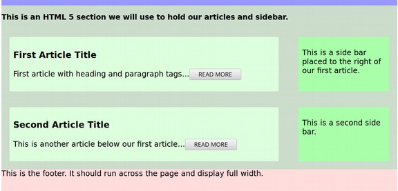
<section> This is a section we will use to hold our articles and sidebar. <article> This is an article with heading and paragraph tags. </article> <article> This is another article. </article> <aside> This is a side bar placed to the right of our articles. </aside> </section> (Closes the section).
Here is an graphic of the HTML 5 more descriptive structural markup.
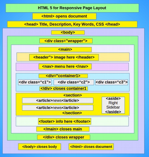
Note that the container we used in the previous discussion of page layouts is still there. In fact, you can add as many containers as you want. Then below the container is the new HTML 5 section. You can also have as many sections as you want. But you cannot apply different styles to each section unless you add classes to the sections such as <section class=”section1”>. You can also have sections inside of sections.
You can also have as many articles as you want. And you can have sections inside of articles. What we show above is simply one way of using the new HTML structural tags. You can use them in any order that you want.
Here is the HTML 5 more descriptive structural markup for the above graphic:
<body><div class="wrapper"><main>
<header>This is a header image.</header>
<nav>This is the navigation bar. </nav>
<div class="container1">This is a container.
<div class=”content1”>This is a Content box. </div>
<div class=”content2”>This is a Content box. </div>
<div class=”content3”>This is a Content box. </div>
</div>This divide closes container 1.
<section> This is a section we will use to hold our articles and sidebar.
<article> This is an article with heading and paragraph tags. </article>
<article> This is another article. </article>
<aside> This is a side bar placed to the right of our articles. </aside>
</section> (Closes the section).
<footer>This is a footer. </footer>
</main></div>These div tags close main and wrapper</body>
Should You Use HTML 5 Instead of HTML 4?
Changing the doctype to the HTML5 won’t break your existing structural markup, because all the structural tags defined in HTML 4 are still supported in HTML5. But it will allow you to use new more descriptive page layout elements like <header>, <nav>, <section>, <article> and <footer>. All yuu really need to do is avoid using presentational tags like <b> and <i>. Also, you should be aware that the beginning of an HTML document is different from the beginning of an HTML 4 document. Let’s create an HTML 5 document and check this out.
Create an HTML 5 Document with Bluefish
Create a new root folder called Justify Grid HTML. Then open Bluefish and click Quick Start icon.
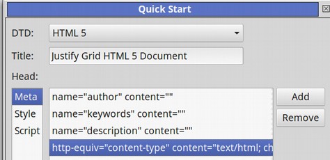
Leave the Document Type set for HTML 5. Name the Title My HTML 5 Page Layout. Then click OK. Then save the document in our new root folder as index.html. You’ll see that the beginning of an HTML 5 document is much simpler than the beginning of an HTML 4 document.
<!DOCTYPE html>
<html>
<head>
<meta charset="utf-8" />
<title>Page Title</title>
</head>
<body>
</body></html>
We have added the author name, keywords and description which help Search Engine Rankings. But they are not required. Copy the style section of our previous HTML Justify document into the head of the HTML 5 document and copy the body into the body of the document. Open it in a browser to see if it still displays correctly. Next, change the container1 or page div class to a main tag. Change the very ending div closing tag to a closing main tag. Then in the head of the document change the associated CSS selector to main. Check the document in the browser to make sure it still displays correctly. Then repeat these steps to replace the heading divide, the navigation divide and the footer divide with HTML 5 tags. Then just above the footer tag, insert the new section content.
We need to add styling to our section, article and aside elements. Add article and aside selectors to: vertical-align: top; display: inline-block; width: 100%;
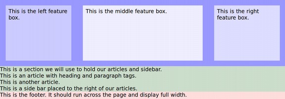
Then give the new elements background colors, percent widths and pixel heights. Add h1 tags and titles and a READ MORE button to each article. Here is the final result:
The Future of Web Page Layouts
There are several new frameworks being offered for web page layout. Bootstrap and Flexbox are both worth learning. However, I believe the future is moving beyond learning a series of HTML tags and CSS selectors to code web pages. I think that folks would rather use graphical user interfaces (GUIs) and design their pages by clicking on buttons. In our next book and course we will introduce the Joomla Content Management System – which is similar to Wordpress CMS but more secure and more well organized. Joomls can be installed to your website in less than one minute.
Joomla comes with a couple of simple default templates. But there are literally thousands of free templates and dozens of frameworks for creating page layouts. One of the best of these is the Helix Template Framework. It can be installed on a Joomla website in less than one minute and fully designed to look however you want in less than five minutes. No coding skills required. Here is a direct link to our course on creating a Joomla website with the Helix Framework.
https://createasecurewebsite.com
What’s Next?
In the next chapter, we will review how to make a navigation menus.